Business overview
Carrot Fertility provides a B2B2C product which gives members inclusive options for forming a family.
I worked on the financial team designing both for the external member experience and admin internal tool that helped the payments team process member medical insurance claims.

Lead extensive user research: I initially lead our team through user research to define this project and roadmap priorities for FY2025.

I balanced and addressed user needs of both the member facing portal and interal admin tool.

I used PM as a thought partner to get early buy-in on implementing design initiated solutions into our roadmap.
Team

My role
Lead Product Designer & Researcher
my partners
Product Manager
Content Designer
Engineers
Payments team
The problem
Patients who are in the process of forming their family need access to an intuitive process for financially funding to navigate their ambiguous and emotional journey(s).
Internal users who process patient expenses, want to efficiently review claims in order to hit their daily metrics.
Challenges
There were many team challenges I identified and had to address before I could begin working on this project:
I joined a team that has never worked with a product designer.
No existence of any prior documentation/data point on user experience in the financial space of our product.

Multiple pain points needed to be assessed on both the member financial portal and the internal admin tool.
User research (understanding users)
Due to the challenges I identified above, I knew that I had to step back to define a collaborative framework for our team and this project. I started by aligning the team in understanding our users and their motivations.
Historically, everything implemented was built prioritizing functionality over user experience. That is why I conducted a holistic user research plan to collect, identity, and prioritize all known user needs and pain points.

I broke down the research plan into 2 segments:
- First focused on the internal users and the admin portal
- Then focused on patients and the member portal

For both research segments, I started out by collecting qualitative data through user interviews and shadowing work sessions to set a base understanding of current navigation and obstacles.

Then I worked with the BI data team to collect dashboard quantitative data from ~10,000 active members. Focused on identifying patterns and mistake around their behavior when submitting claims.
Key insights
Over 78% of denied expenses are denied due to missing documentation.
Action item: We needed to better educate members about the documents they need to submit before they submit expenses in order to reduce the number of denied expenses.
Over 3,000 of expenses are denied every quarter.
In interviews conducted, both users expressed frustration in having to resubmit entirely new claims when current claims are missing information for approval.
Action item: Since we learned that the most common reason for denied expenses is missing documentation, we need to provide both patients and payments team a direct way to follow up on and correct already submitted claims.

Claim processors spend about 2.5 hours of their daily time reviewing all of a member's previous expenses to identifying any conditional member exceptions.
Every claims processor review over 50 expenses a day and spend an average of 7 mins per claim reviewing previously submitted member claims for individual member exceptions. The payment team performance is measured by number of reviewed claims per day.
Action item: To increase efficiency and reduce time spent per claim we need to give internal users a way to view member claim history across all expenses.
In order to address the pressing user needs, I segmented our key insights off into 3 digestible design solutions/workflows...
Solution #1: Educating patients
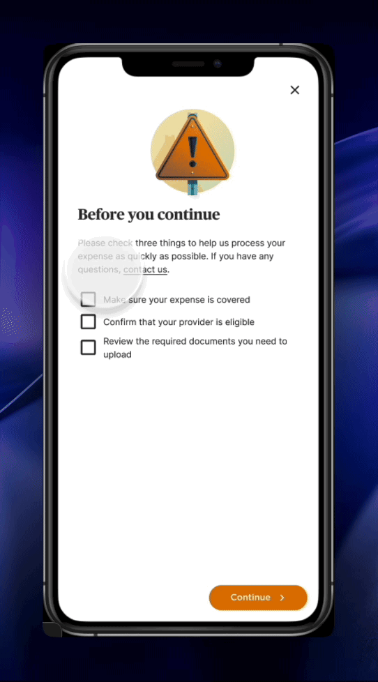
Starting off with reducing poorly member submitted claims, I worked with a content designer in creating a preventative barrier for submitted incorrect claims at the beginning of the member reimbursement flow.
Before patients submit their medical claims to our team, they will review content that educates them on the exact documentation needed for their journey type to prevent bad claim submission.
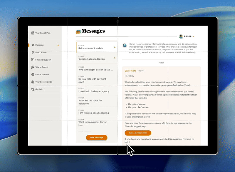
Solution #2: Allowing resubmissions
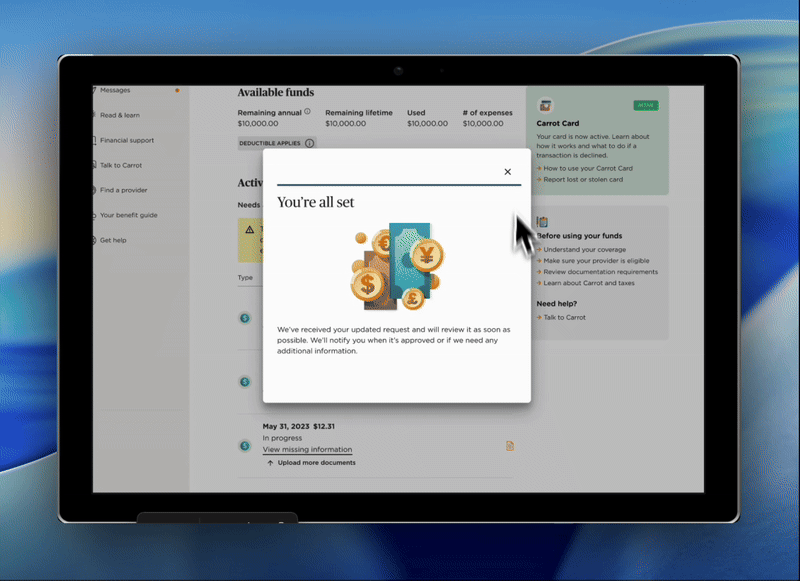
While the first solutions support prevention of poorly submitted claims, the product manager and I brainstormed a new workflow for allowing members to directly upload additional documentation to already submitted claims that will notify payments team in our internal tool.
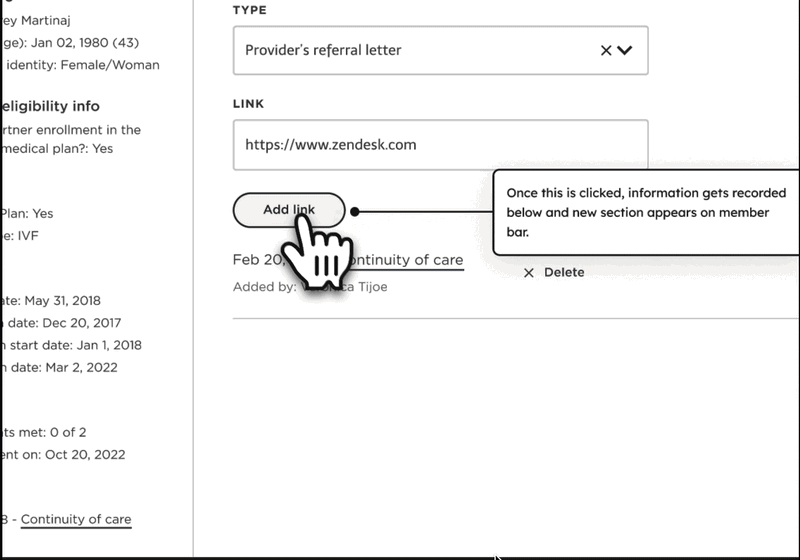
Solution #3: Providing access to right information
I worked closely with the payments leadership team to brainstorm a solution for providing their team access to the right member information across all expenses. This would help the team reduce the time they spent reviewing each claim.
Accessibility in handoff
Before handing off designs, I knew WCAG compliance was a priority for our entire UX team so I went ahead and documented HTML semantics and created a11y annotations with the design systems team.
Post handoff, I continued collaborating with engineers through QA testing ensuring the implementation was true to our designs and all edge cases had been accounted for in our design files.
Impact

20%
decrease on number of total denied expense saving costs for both patients and internal team.

Eliminated painful user flow
of submitting new claims due to missing information. Allowing members to correct/update submited claims.

2 hours per day
average time reduce internal team's reviewing claims
Final deliverables: Member account
Final deliverables: Internal admin tool
Moving forward
Although the pain points and needs of external and internal users intersect, in order to help me holistically identify and address all the needs I strategically segmented this project into 2 separate sections to help my team better digest the amount of work we would take on.
This was my first time bringing in non-UX team members into the early user research stage. However, bringing in the Product manager early on allowed the both of us to sync on feature priority. Although I lead the entire user research plan, I kept interview sessions open to both PM and engineers for transparency on how I was assessing UX priorities.
When dealing with having member walk through their frustrations, I found that often times they try to solution and propose 'ideal ux features'. However, some of the proposed solutions were either technically infeasible to implement or not scalable to the platform's ecosystem. Therefore, I'd focus on identifying the core of the problem rather than proposed ideas in order to find an optimal solution.


.svg)