Business overview

Color is a population health platform that seeks to bring health services to large numbers of people.

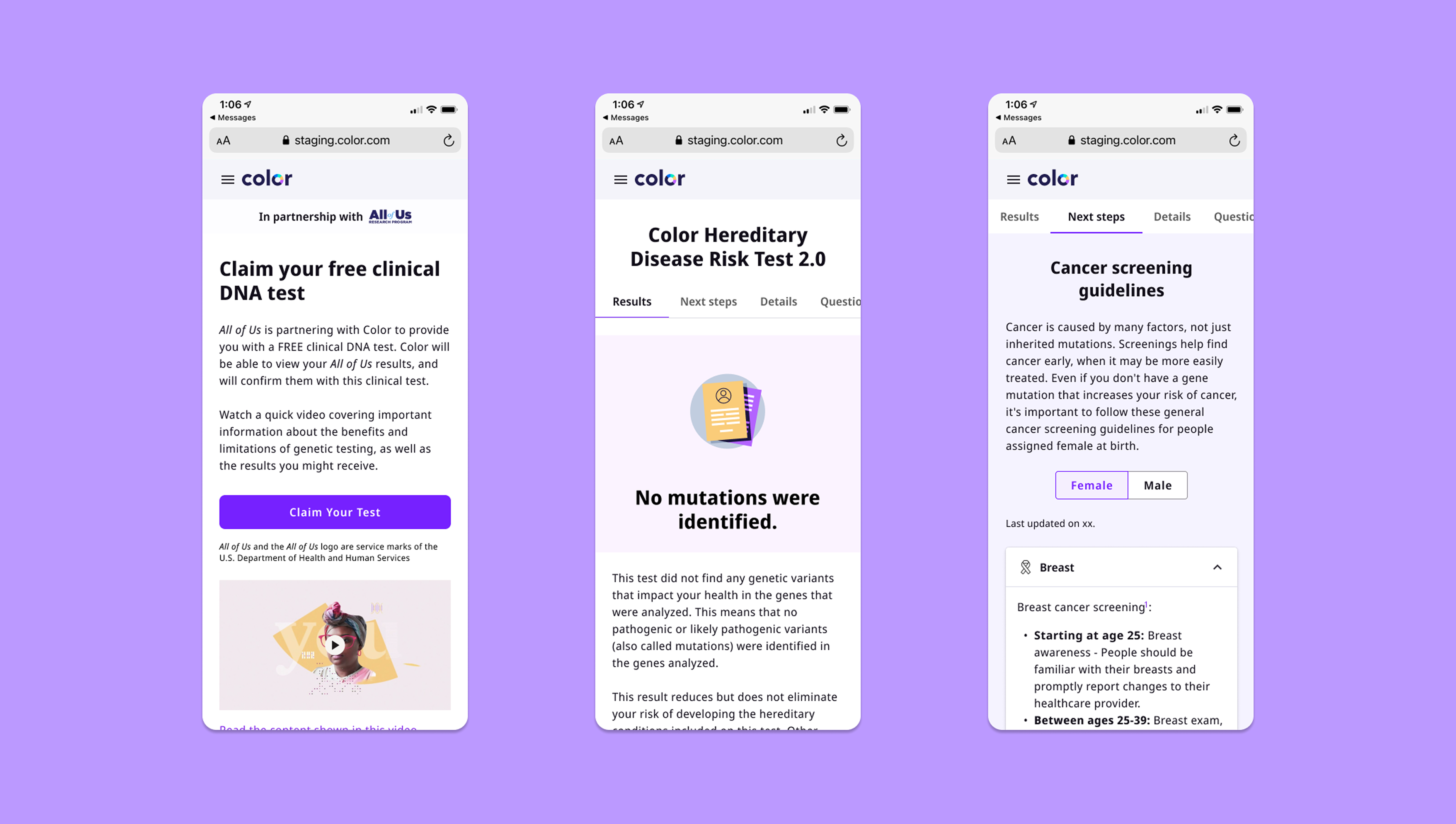
For this project, we collaborated with the National Institutes of Health (NIH) to provide participants from the All of Us Research Program access to free clinical confirmation results. The All of Us Research Program is on a mission to diversify what we know about genetic data by partnering with over 1 million American participants to make medical research more representative of the US population.

I was the lead designer on this huge collaborative contract. I focused on designing the end-to-end experience of this new product for both mobile and desktop experiences.

Designed for a large diverse population since the All of Us Research Program served folks who are historically underserved in medicine.

I balanced dual constraints & requirements, designed solutions within limitation of in-house constraints and  NIH's own requirements.

Product was be key source of revenue for Color and opened opportunity to work with other enterprise sized clients.

End-to-end experience

For this project I led design for the entirely of this new product named Hereditary Disease Risks 59 (you can preview all screens below on a desktop device). This included user flows such as...

Designing the result reports

Although I led the design process for the entire ecosystem of this new product, I'll go deep into the Results report to show my design process from beginning to end.

Team

My role

Lead Product Designer

my partners

Product Managers
Engineers
Content Strategist
Product Designer
User Researchers
Genetic Counselors

The problem

Patients with 'positive' genetic results are looking to make personal medical decisions based on their research results. Since the research reports they receive through the program are not 'clinical' tests, they need a way to turn their results actionable.

Challenge #1: Defining design scope

I worked with product managers across Color and the National Institutes of Health (NIH) teams, and set sprint expectations on the design progress for the web report Hereditary Disease Risk Test for 59 genes.

Although Color provides genetic testing products, we had to build a completely new experience for 3 main reasons:

Scalability: Color historically breaks down genetic testing into 3 different reports but our collaborators required a single unified report experience.

Growing genes: Current Color genetic reports only show results for 30 genes categorized as cancer, cardiovascular, and metabolic genes. New report analyzed 59 genes that don't fit into those categories.

Migrating code: Engineering team was migrating Color's front-end code from Angular to React which required building front-end work from scratch.  Meaning, eng costs would be the same for creating new ui components.

This gave our team an opportunity to explore completely new user experiences and improve from our current products.

Understanding patients (users)

I collaborated with researchers, genetic counselors, and a designer from the All of Us Research Program to better understand their patients and their user research findings. I defined these 3 user pain points in the product experience:

Patients needed an accessible navigation mobile experience: The research participants are a diverse sample of the US population. 72%+ were mobile first-users. All coming in with varying levels of tech literacy.

Patients need to be able to understand their results: Color content is written for a 12th grade reading level.
The incoming patients read at an average 7th grade reading level and were non-native english speakers so there was a gap in written content.

Patients want to use their information: Beyond just giving patients a clinical confirmation report, they want know what to do with that information and be able to share with their health provider.

The solution

To provide participants in the All of Us Research Program a new free clinical report, we named Hereditary Disease Risk Test (HDR59) to confirm their results.

Research

Although our team was building a new product from scratch to adhere to the new requirements from the NIH and their users, I identified an opportunity to take learnings from our former genomics reports through a cognitive walkthrough with our pms.

I also conducted interviews with clinicians to better understand user's current experiences and pain points.

Key insights

Need for accessibility and digestible data: We found that the current risk charts on the report were difficult for our target user to understand.

Easing navigation: The different sections or 'tabs' of information in the report were difficult for patients to navigate. Most patients could not find all the information they needed in the current reports.

Overwhelming layout: The current layout of information was overwhelming to for most users to read. We needed to find a better way to layout all the information and show users only what they need/want to read.

Challenge #2: Creating digestible data

As part of addressing our users paint points, I met with genetic counselors to learn about all the result edge cases I should consider before creating a scalable genetics report template. This including things like showing reports with single mutations, more than one mutation, double mutation in a single genes, reporting additional findings that aren't quite mutations, etc.

Organizing complex data

I also worked closely with a genetic counselor and content designer to break up all the patient information we'd need to share with patients. I used Information Architecture to organize all this complex data in a clear and logical manner.

I transformed those categories into sections for the web report and shared with our stakeholders to align on the core structure of how we present information to patients.

Empowering patients (turning data into actions)

Aside from organizing information into a simple way that patients could navigate. We also knew that it was important to give them the agency to not only understand but use their information. We created features that meet those needs while balancing those needs with HIPPA compliance.

Usability testing

After creating my first round of mockups of the entire experience, I worked with a user researcher to create a research plan that would allow us to test the new designs.

Overall, we obverse improvements on all the user pain points we identified earlier (understanding content and able take action on results). However, we found that the order of information did not meet the expectations of patients and quickly reordered categories to further improve navigation.

We added navigational tabs at the footer of the report and moved the navigational tabs to the top of the report to increase the likelihood patients view all the information.

Challenge #3: Expanding design system

Since I worked with a small but growing design system, designing new components would help me better address users needs. I extend our icon library to provide visual ease in displaying content and created tabs and accordions to break up information into digestible sections.

I stressed tested these new components in design critiques to ensure they were useful to other product designers and provided a consistent & accessible experience across all our products.

Accessibility documentation

Before handoff, I ensured the visual elements of my design were WCAG complaint and documented HTML semantics to ensure that the experience transferred to assistive technologies. My focus was on documenting for easier keyboard and screen reader navigation.

Impact

259,000+ participants

were provided with access to informative (positive) clinical confirmation results.

$16.8 million

was generated in revenue.

80% of participants

are underrepresented in biomedical research.

Final Deliverables

Moving forward

Thankfully, there were never too many challenges as I worked with a phenomenal team of people who are experts in their field. Here were some valuable lessons I learned from this project.

Value of early engineering input

Since we built this product from scratch, I found it useful to include engineer input in explorations earlier than on other projects to understand engineering costs and define my explorations. Designing new product meant considering the use of new UI components that were not yet in our design system. I partook in design crits and eng office hours to bring new components and stress test their potential use cases.

Providing many outlets for feedback

Since I worked with many teams and stakeholders on this project as the lead designer, they all had varying levels of communication that I accommodated to. I used video meetings, slack, email, and even video recordings to provide several outlets for feedback.

Bringing in experts

Breaking down content was the most time consuming part of my process. I constantly brought in our the genetic counseling experts and our content designer to ensure we were delivering clear and actionable information throughout the entire user experience. I've worked successfully as a solo designer, but I learned I work even better on a team.

Carrot Fertility Finances