


Paytient is a B2B2C fintech platform that partners with employers & health plans to help members pay for healthcare over time. In 2024, the company entered the Medicare space to serve a massive & underserved market of 25M+ eligible Americans who face complex prescription costs, low digital literacy, & strict regulatory requirements.
I joined as the 1st & lead designer on this initiative. There was no existing product, no user research, and no design precedent for how a financial health platform should work for this population.
As the Lead product designer, I was responsible for defining the product architecture, building the research infrastructure, architecting the design system, bridging design, engineering, & elevating org-wide design quality.
Product Managers
Engineers
Content Strategist
Legal & Compliance partners
Client partners
Designing a Medicare financial health platform presented challenges that went far beyond typical product design.
Medicare beneficiaries had never interacted with a product like this. There was no established UX pattern for how seniors navigate prescription financing.
Every screen, every interaction, every piece of copy had to meet CMS compliance and client requirements (Humana, Express Scripts, & CarePlus). Design directions were led by a balance of UX decisions and legal decisions.
The population we're building for had varying digital literacy, many non-native English speakers, and many interacting through advocates.
No user research existed. No design system. No component library. No voice & tone guidelines. Everything had to be built from nothing.
My first move was to build the research infrastructure the team would operate on.
I led in-person & remote research sessions in Columbia, Missouri, working directly with Medicare beneficiaries & their advocates. While compiling insights, I also set up systems & documentation for all future user research at Paytient.

I created the first standardized research template so any researcher, PM, or designer could run a session and produce consistent, comparable outputs.
I synthesized notes from multiple observers, compiled key findings, and ranked each finding by priority, impact, & effort using AI tools.
I conducted a complete competitive analysis of other payment products to identify gaps & opportunities in the space.
I observed advocate calls, tracked payment bugs, & continuously fed findings back to our product teams. These insights helped me author our Senior Insights & Future Guidelines deck.
Many beneficiaries interact with the platform through advocates, family members, social workers, or caregivers. This insight led me to design dual-persona flows, ensuring every screen worked for both the member and whoever was helping them. The result: our advocate-facing flows handled 40%+ of all interactions without requiring a separate product.
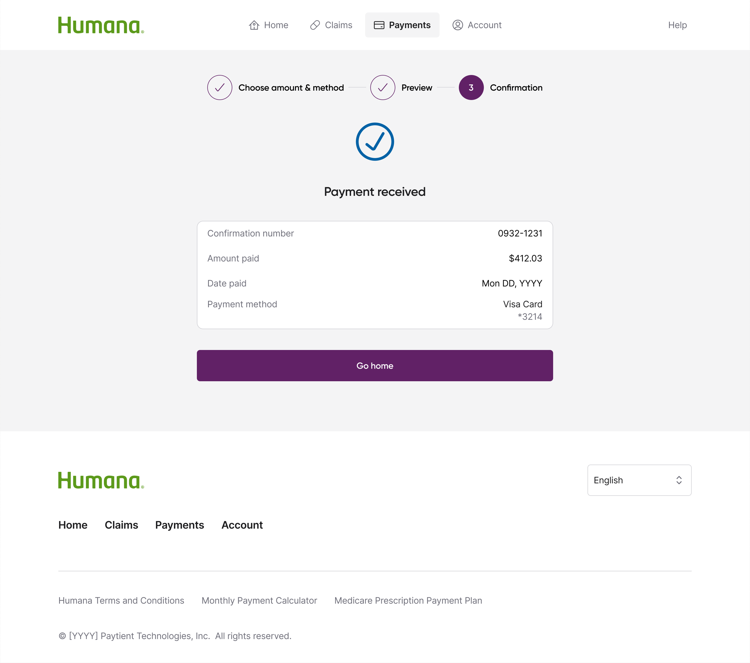
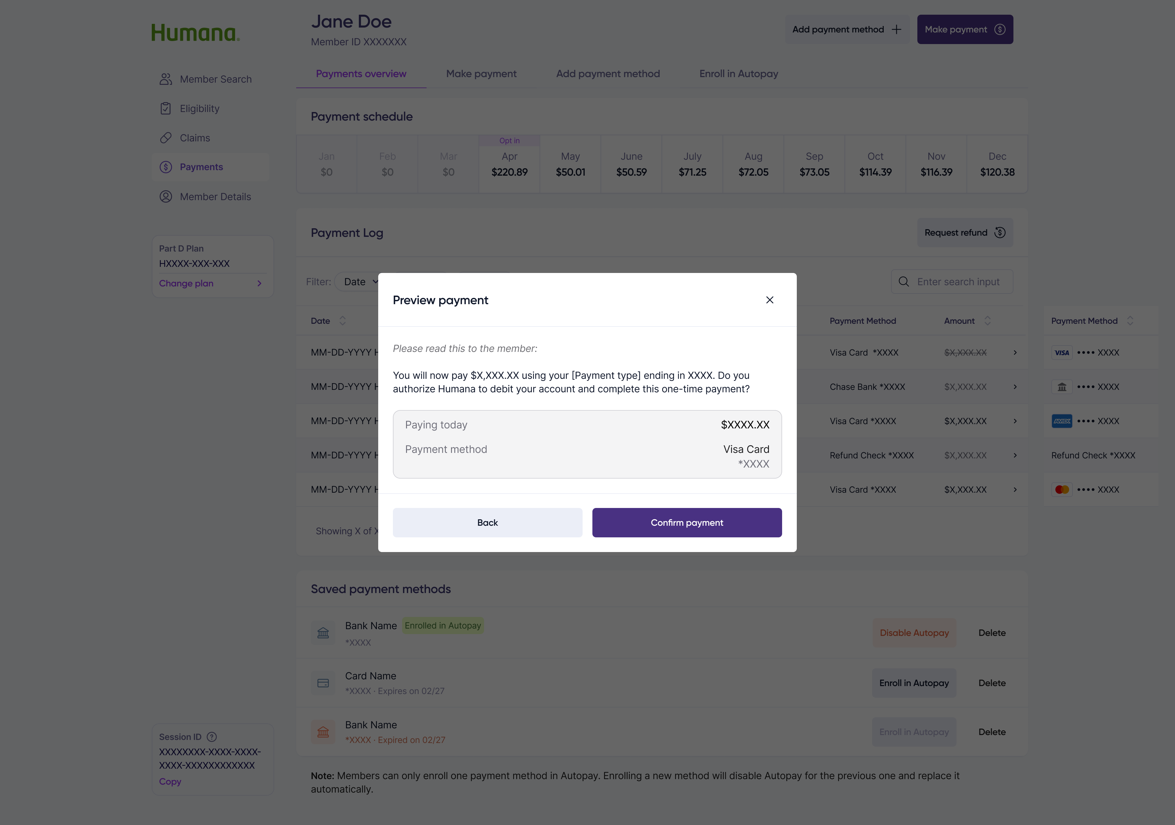
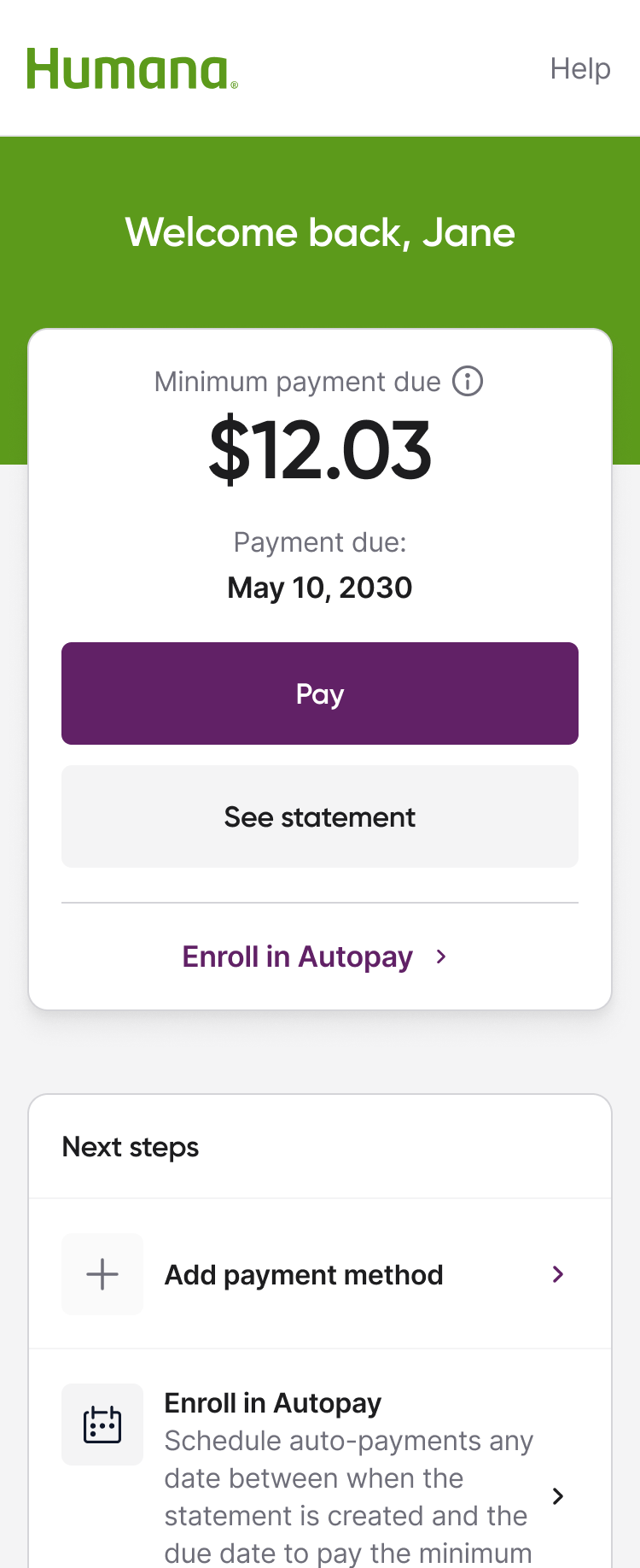
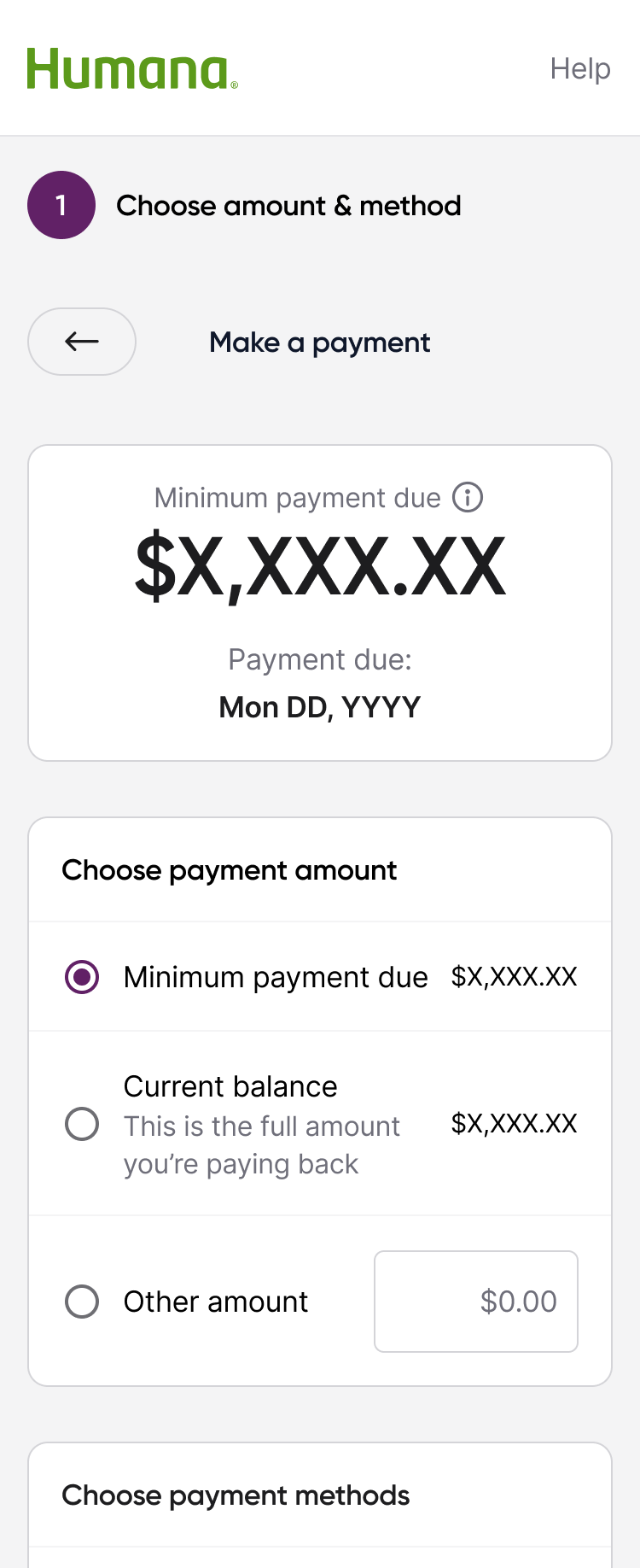
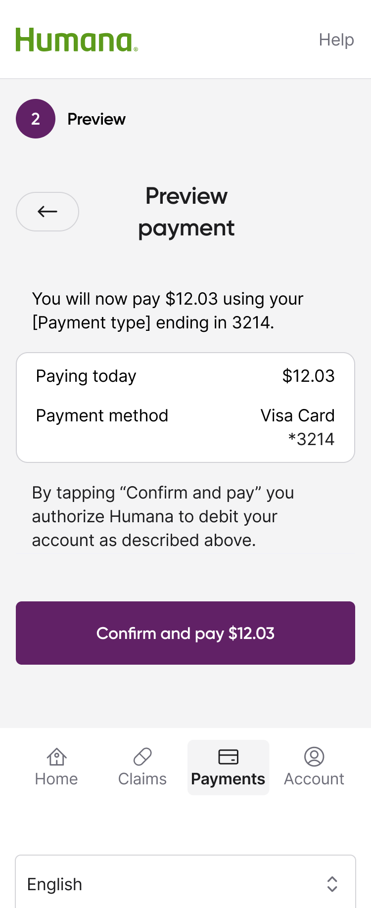
For a population that has experienced decades of confusing Medicare paperwork, the primary barrier is not "can they use it" but "do they believe it." This shifted my design strategy from optimizing task completion to optimizing trust signals. I introduced transparent language, visible payment breakdowns, and confirmation steps at every critical moment. This led to a 95% payment success rate validated that trust-first design drives completion.
Stripping out information to make things 'simple' actually increased anxiety. This insight reversed our initial design direction. Instead of minimalist screens, I designed information rich interfaces that showed members exactly what was happening with their money at each step. Clarity over simplicity became a core design principle that carried through the entire product.
The biggest design decision I made was to not start with screens. Instead, I defined the core primitives that everything else would build on. I designed a white label to create a product that worked with our growing clients so starting here was a strategic decision.
I built a decision-making system through designing out our UI component library. Each of the components carries embedded accessibility requirements, interaction logic, & usage guidelines. This ensures that when another designer or engineer picks up a component, they make the right choices by default.
I used AI tools to stress test & document usage rules for our UI components. I defined when to use each component in order to reduce inconsistency across 4 teams.
After completing Deque accessibility training, I embedded WCAG compliance directly into component documentation with eng. Baking it into the design system rather than waiting until QA.
Since we had no permanent content designer, I defined the voice & tone guidelines for how the product communicates to Medicare beneficiaries & advocates. It became the reference standard for all content decisions on the product team.
I created structured critique templates specifying what kind of feedback is needed at each design stage. This reduced ambiguity in reviews & raised the quality bar across our teams.
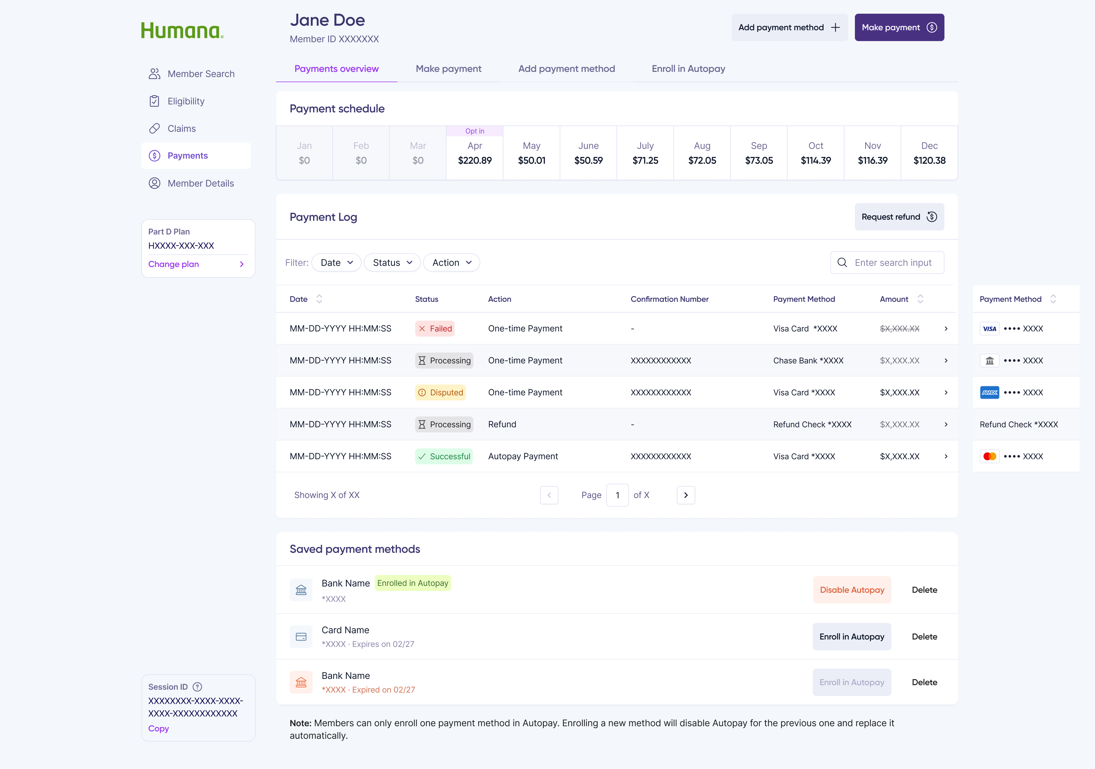
The multi-modal payment flows were the highest-stakes design surface on the platform. A wrong edge case in Medicare payment processing is not only a bad experience but also a compliance risk. I mapped the complete platform logic.
Different payment types follow different paths. I designed the routing logic and corresponding user flows for each payment modality.
What happens when a payment fails? When eligibility changes mid-flow? When an advocate initiates on behalf of a member? I documented and designed every exception case.
I was designing the payment flow for 2 different platforms and 2 different user groups on the same product. So I made distinct interaction decisions based on each user's needs and motivations.


After completing Deque Systems training, I did not just apply the learnings to my own work and the design system of this product. I also systematized them for the entire design org.
I partnered with eng to update every atomic component in the design system with ARIA annotations and keyboard interaction specifications when needed.
I created a reusable Figma template following A11y best practices that any designer on the team can use as a starting point.
I created comprehensive A11y documentation so other product lines could reduce their onboarding time when they begin accessibility work.
I collaborated with designers to bring accessibility feedback into every design review, raising the bar for the team without creating a bottleneck.
Summarizing my most recent performance review related to this project, my team would describe me as a ‘multiplier'. I'm not only thinking about how to advance my own work, but about elevating everyone around me. Here is what that looked like in practice at Paytient.
With the rise of new tools, I started treating our internal processes as the product itself. I began experimenting with LLMs to compress my own discovery & design cycles, and once I proved the efficiency gains, I knew I couldn’t keep those "superpowers" to myself. To turn individual wins into a team-wide standard, I developed our AI-Augmented Workflow Playbook.
I identified a handoff friction point across the engineering org. Nobody asked me to fix it, but I reached out to the VP of Eng to gather requirements, build the curriculum, & delivered end-to-end training that ended up reducing handoff time for the entire engineering org.
My Deque training benefited the product I was designing & I used it to create documentation & templates that other product managers & designers would use when beginning their own accessibility work.
I created design principles, voice and tone guidelines, research templates, design critique structures, etc. All artifacts I created that now live beyond my individual work.
I initiated complete competitive analysis of other Medicare products, conducted secondary research, built data dashboards entirely on my own initiative to shared it as a team resource. These digestible research decks continue to inform our product strategy & roadmap.
in revenue generated. Making up ~33% of the company's revenue from a product I led as sole designer.
success rate achieved in processed payments through UX accessibility practices.
AA WCAG compliance met through design system updates & documentation


I pour everything into my work. Yet the end of every project reveals what might've been missed in the beginning, sharper questions I should have asked, frameworks I've since built, and tools that didn't exist when I started. That gap is where growth lives and I chase it deliberately.
I defined the platform primitives through design, but in retrospect I would have pulled engineering & product into the primitive-definition process earlier. The shared language would have been even more powerful if all three disciplines co-created it from day one.
The 38-component system works, but adoption was organic rather than orchestrated. If I were to do it again, I would pair the component library with a formal rollout plan: workshops, migration guides, and adoption metrics.
The training, documentation, and frameworks I created had real ROI. It ended up reducing onboarding time, fewer handoff errors, faster alignment. Had I known the potential impact, I wish I had been tracking those metrics from the start.